Reducing drop-off rates for a wealth tech company
Background
Aqumon is a wealth tech company that provides automated investing services. Their personalized investment advice is powered by AI technology, also known as robo-advising.
Challenge
The biggest challenge Aqumon faced was the drop-off rate with their account sign-up process, which was close to 70%. Only 7% of the 70% completed the onboarding journey and went on to invest in the platform.
Objective
The goal was to improve the sign-up process and reduce the drop-off rate by making it more fun, simple and useable.
Design Process
- My role: Lead UX designer with a team of 4
- Skills Applied: user interviews, competitive research, wireframing, high-fidelity mockup, usability testing
- Timeline: 1 month
User Research
We interviewed 20 users between the age of 25–40, and discovered around 50% of them are passive investors. They possess 1–2 blue-chip investments that they intend to hold for at least 5 years and look for steady growth in returns. They are intimidated by investment information and are overwhelmed with the advice they seek from their peers or the internet.
Persona
We took these insights and developed a persona of our target audience, Stephanie.
She invests with her bank mobile app, and only checks her portfolio performance once every 2 months whenever her statements arrive. Since she is unmotivated to read about investment analysis or the news, her lack of knowledge makes her doubtful of herself when she chooses investment portfolios.
She has a “buy-and-hold mentality” as in she tends to purchase an investment and doesn’t change her portfolio regularly. Stephanie needs a credible and personalized investment portfolio match, so she can invest with confidence.
Business Constraints
It is inevitable that financial apps have to go through a lengthy on-boarding process of having clients submitting their personal information including their income, ID and address proof as these are a part of the laws and regulations. Our users who are unfamiliar with using investment apps do not understand this is the norm. They quickly lose interest and patience as they compare their experience to seamless everyday apps like Facebook, Spotify and Netflix.
Our Solution
Although we can’t omit the steps of inputting personal information, we can make the sign-up process more engaging by having users fill in the fun elements first, and saving the mundane information for later. This shift in the user journey makes users feel they are being understood and cared for, which nurtures them to want for more. Therefore, we redesigned the customer journey by focusing on 5 major features.
Feature 1.1: Rearranging the order of the journey
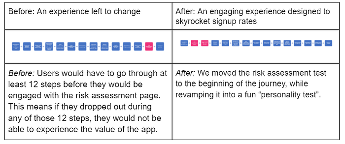
Benefits: This enables users to experience the worth of the app before filling in their personal information, which makes the users feel like the process is less invasive. This will increase trust, and subsequently the signup rates when it comes to providing their personal data.
Feature 1.2: Revamping the risk assessment
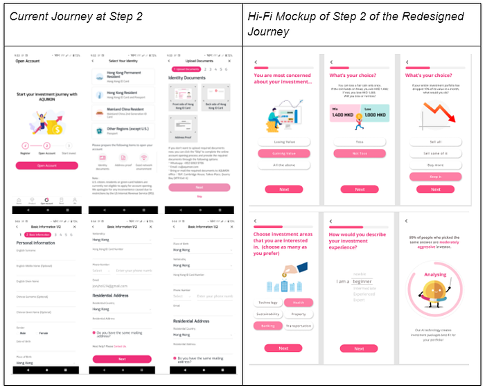
These questions are exactly the same set of questions that are seen in any financial risk assessment test, but we revamped it with fun graphics and displayed only one question per page to make it more engaging and less intimidating. The questions are based on the: a) investor’s attitude, b) investors’ interest and c) investor’s personal information.
Benefits: The reordering of the questions elicits the feeling that the test is more comprehensive, and it’s designed to understand the users’ underlying thoughts and behavioural patterns, which gives users the confidence that the analysis will be more accurate.
In fact, from our usability testing, users didn’t mind having an even longer test, as they want to feel understood thoroughly so their needs are addressed. We even added an extra question asking for users’ preferences in investment areas, which helps the recommended portfolios be even more customized towards the users.
Feature 2: Guiding users through the journey
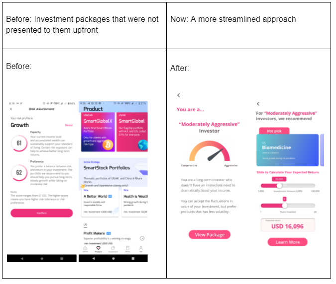
Before: Users had to go through 13 steps before they can start exploring the investment packages. However, it wasn’t clear what the next steps were or which portfolio is more suitable for the user after the risk assessment results.
After: We have moved the risk tolerance analysis and suggestions on personalized investment packages to step 3 and 4, which is right after the “personality test”. As users are often overloaded with investment information, they fail to make a sound decision. We limit the personalized investment packages based on their interests and risk appetite to only 2, in order to prevent information overload.
Benefit: Showing an easy-to-understand and concise analysis along with the suggested portfolio can immediately demonstrate the accuracy and credibility of robo advising, empowering the users’ investment confidence.
This also allows users to build their trust and loyalty towards the platform and understand its unique value at an early stage. Later on, they will be more willing to continue on the lengthy sign-up journey, reducing drop-off rates.
Feature 3: Providing customized recommendations with transparency

Before: Users will have to explore and study each option on their own.
After: The newly added “Smart Calculator” function enables users to estimate their projected return on investment, so they can see the anticipated amount and duration they should invest in.
Benefit: By taking the guesswork out for the user, we can boost their confidence and empower them in making decisions.
Feature 4: Providing just the right amount of information

Before: For users who are intimidated by graphs and financial information, the current design will make them feel overwhelmed and turned off.
After: We provide explanations on why this investment package fits them based on their needs and market trends. We also intentionally hid the intimidated graphs and overloading information, so the user can explore the information at their own pace.
Benefit: Provide a solid rationale on suggesting the packages based on users’ background and market trend which allows users to feel the power of the AI technology and the value of the platform, hence being loyal customers.
Feature 5: Providing reassurance and confidence
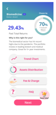
The bubble on the top with “Chosen by 70% of moderately aggressive investors”, gives users the assurance and confidence that this portfolio is suitable for them and others have also gone with the choice. We also comfort them emotionally by stating investors with similar type and interest have chosen the package so this is a real-fit choice for them.
Benefit: Because our users are long term investors who seldom change their portfolio, they need strong reassurance that the portfolio is highly suitable for them, through sensible rationale as well as emotional reassurance.
With these updates, the user is now confident to make a sound decision, excited to invest and proceed to the account registration stage to start their investment.
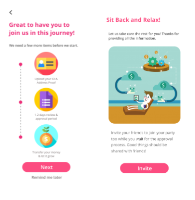
Conclusion on the Redesigned Journey
We reduced the drop-off rate by engaging users to experience the risk assessment test and portfolio recommendations at the beginning instead of after they sign up with all their personal information. This positive user journey allows them to feel understood and understand the value of this platform.
The 5 major features we redesigned included:
- Engaging users early
Rearranging the order from step 13 to step 2 of the journey and engaging users with the risk assessment test, so they can interact with the platform early on before submitting their personal information. - Integrating appealing elements
Revamped the risk assessment by making it fun and engaging like a “personality test” to make them want for more. - Building trust through knowledge
Providing a concise risk assessment analysis along with the suggested portfolio immediately to demonstrate the accuracy and credibility of robo-advising, and empower the users’ confidence in investing. - Strategic design to shift perception
Redesign the UI and hide the graphs and numerical information to make our users feel less intimidated and overwhelmed. - Empowering through social proof
By stating a majority of investors with the same risk type and interests who have also chosen the same package can provide users with reassurance when investing
Experience the Redesigned Journey

**Click here to enjoy the prototype **
Sponsor’s testimony
